
An award-winning concept turned into reality for making the most of empty parking spaces across the country.

List your unused parking spot along with amenities and make money renting them out to other car owners while tracking your history and income.

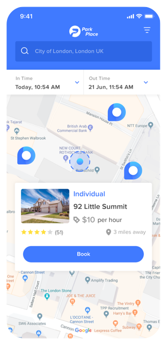
Find a parking space nearest to your convenience in the busy downtown streets. Safe private parking spots with lower costs than public parking.

Plan your trips and book spaces in advance or pay for recurring parking space for daily travel and save time (and annoyance) figuring out where to park.
A meticulously planned design process keeping user experience and demographics as a priority.
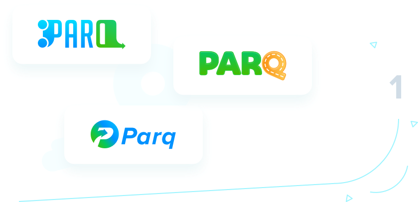
With an easy to relate app name in place, a strikingly familiar logo with colors indicating easy to recognize ‘Park Place spot’ were considered.
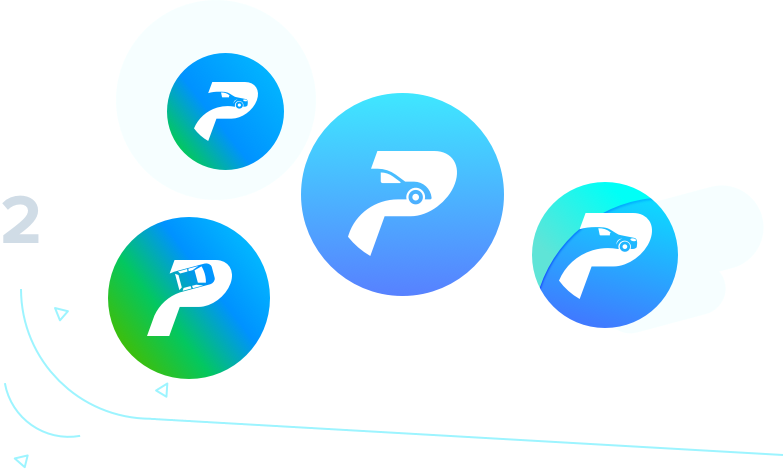
Finally, a P + Car were chosen according to a focus group survey to best represent the brand and its features on the Apple app store.
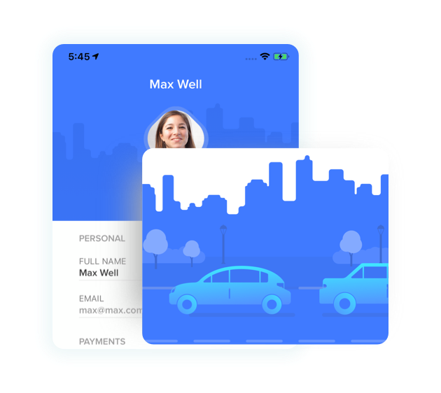
A minimalistic look to achieve amazing grey – blue gradient combination among icons and app backdrops that stand out to the user.
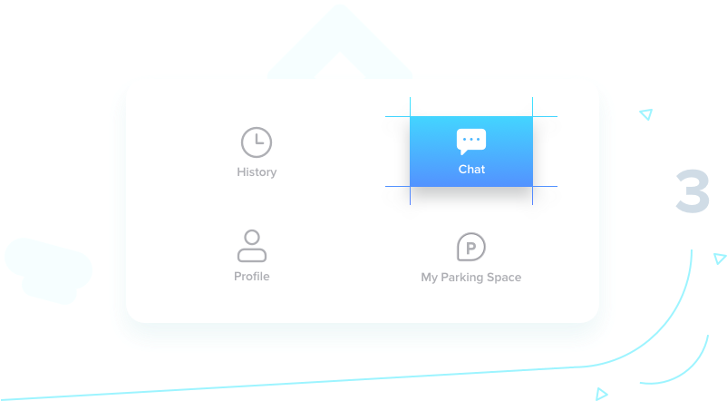

Deviating from a common flat perspective, our team decided to have a flat-2D elements to the app screens to provide interaction that goes beyond into marketing.
An UI that resonates a cool,
futuristic on-demand parking app concept.
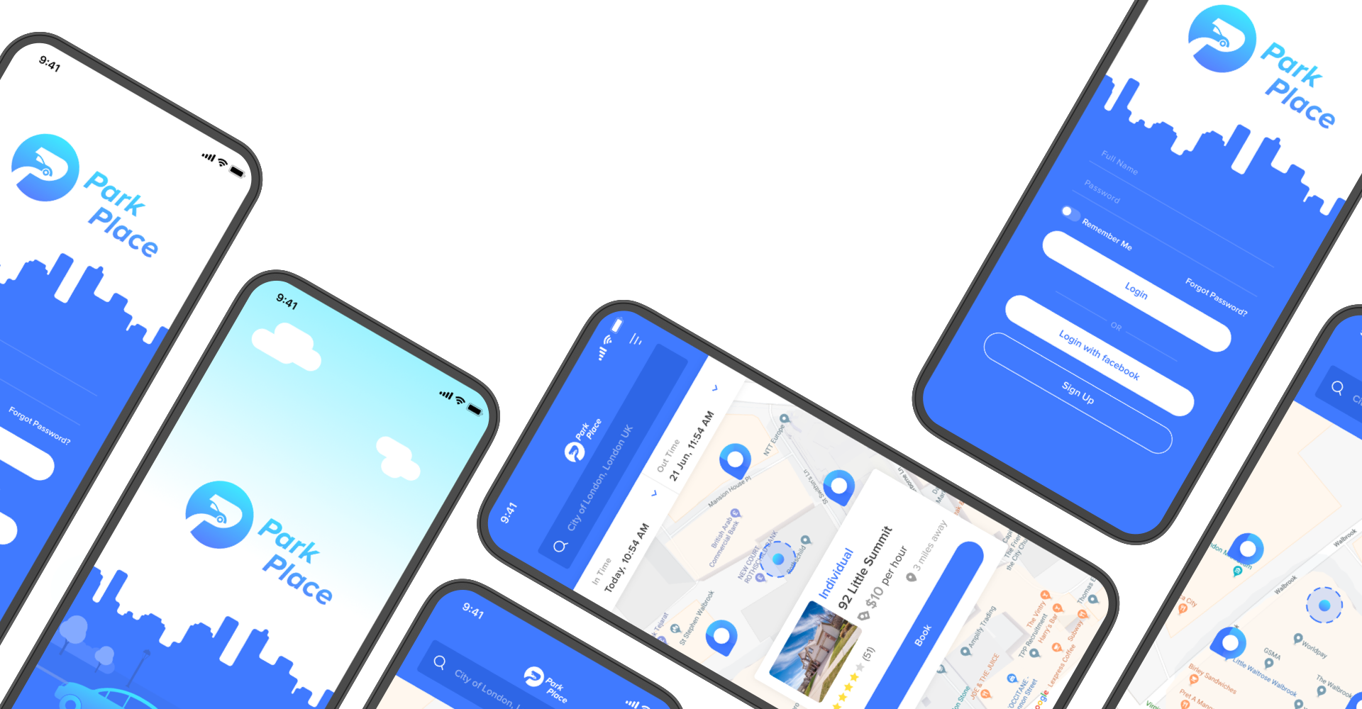
A 4-month logical and algorithmic fight to ensure a seamless parking experience

Converted the designs into a functional prototype with UI enhancements & animations.

Quick and seamless API development with admin dashboard using Laravel framework.

Senior developers at Wve did clean coding using MVC structure and Swift on xCode 9.

After a successful beta in April 2019, the app went through 3-stage quality check before release.
Seamless and functional design & development using latest, tailored technologies.

 Swift
Swift
 Sketch
 Laravel
 AWS
AWS
 PHP
PHP
Easy is boring! We found a few hair-raising challenges on this parking journey.
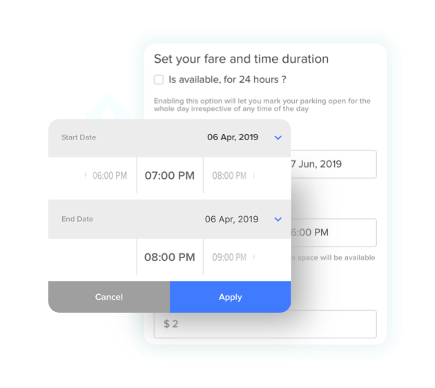
Managing hours for the time booked and making sure that the booking doesn't overlaps with other bookings.
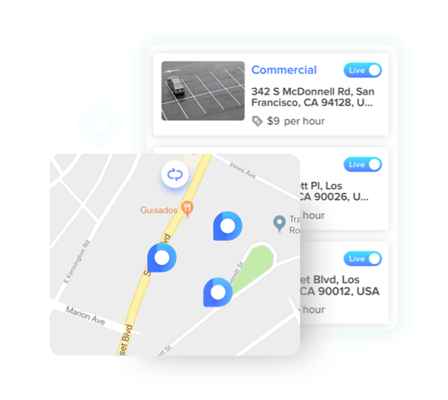
An easy way out to find places near user's location with just a click of refresh. The map will be focussed to the nearest parking spot making for the user easier to do it.
Shapes, colors, typography is what we took care while building its designs, making the app look sharp and stand out via colors.
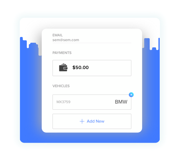
Enabling the user to withdraw what they have learned. Managing the money as earned by the user and also managing the cancellations and reflecting the same back in wallet.
Seamless and functional design & development using latest, tailored technologies.