 App Store
 Play Store

iOS | Andriod | Support
A platform thats helping over 200k people globally to reduce stress and improve mental well-being.

Concept
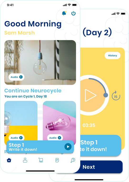
A video and audio experience of a world-renowned 5-step brain detoxification process by Dr. Caroline Leaf.
Availabilty
Global
What Wve Did?
UI/UX, iOS & Android App, Backend, Live Support
Industry
Lifestyle, Health
Platforms
iOS & Android
App Features
The app explores the potential of brain stimulation and detoxification through audio and video sessions.
Re-Branding / UI UX
 New Design
Logo Design
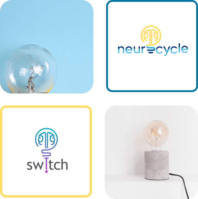
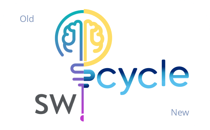
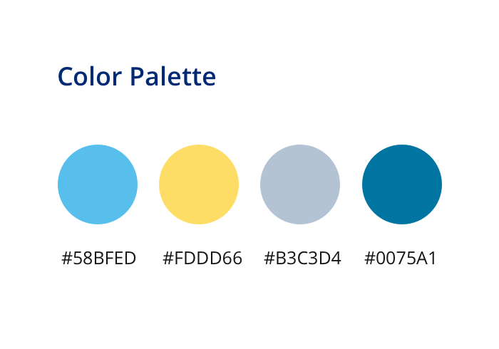
With a switch in branding, the logo had to represent what the older platform stood for so that the transition was seamless for already existing users.
Challenges

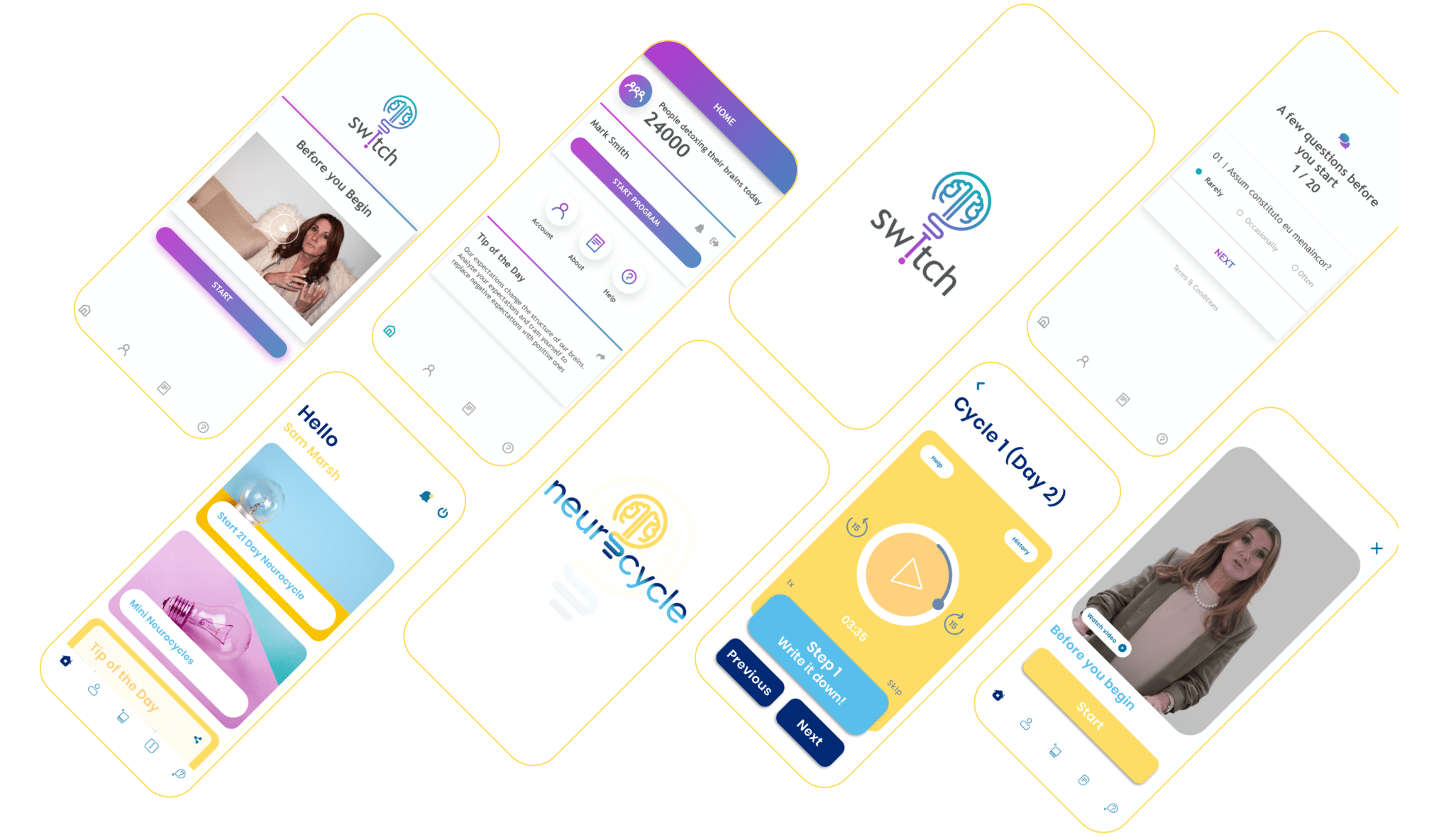
This is the next version for the Switch App. Client wanted us to do complete rebranding with new colors and graphics for their existing app in the minimum turnaround time. We focussed on re-designing all the screens in such a way so that we can utilize 95% of the exsiting code. We acheived this by keeping the same number of elements on each screen as they were in the previous version.
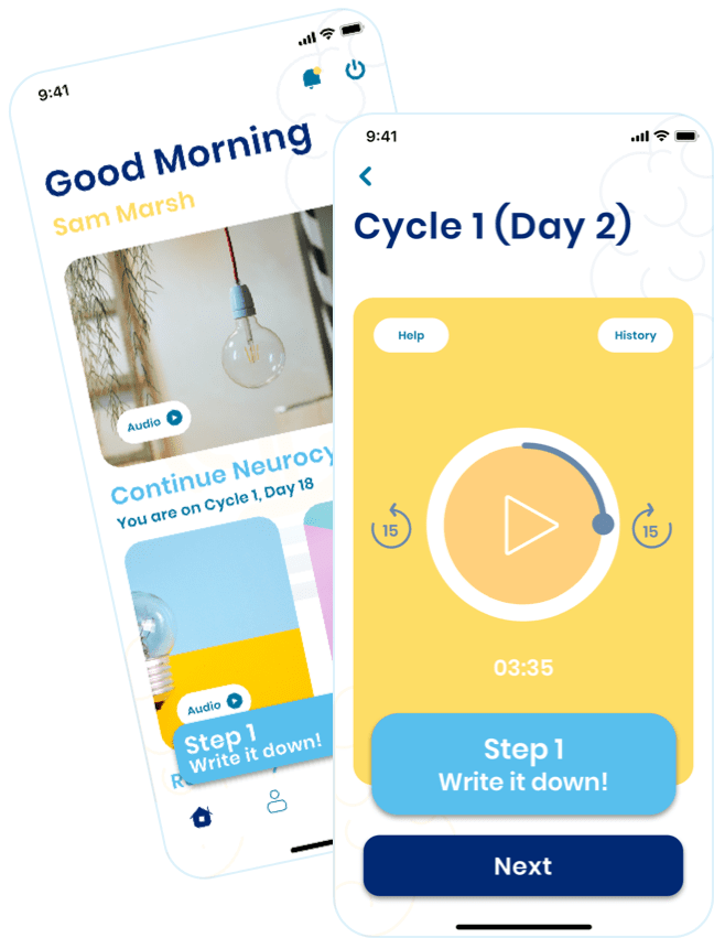
Client had requested us to come with a more intuitive seek baar rather then a traditional horizontal bar. We came up wit hthe idea of keeping a round seekbar and this transition proved a little bit challenging as we were supposed to manage the 15 second forward and backward audio seeks on the new bar. Our team made a fully custom seek bar and media player to accomodate any future media add-ons.


A major user feedback in version 1 was the speed of the audio guides. As the application is built for mind relaxation, we needed to hear our users and bring a feature which enables the them to slower the pace per their comfort level. We added 4 levels of speed tunings (0.5x,1x,1.5x and 2x) to accomodate a variety of needs.
In version 1 the mini audios were displayed in a clickable list view, which was now to be changed to a grid view with thumbnails and ability to play pause directly from the grid icons. Wve redesigned the whole module while keeping 75% of existing code to match the client’s delivery expectation and made each grid icon act as play/pause the button.

As the application has more then 100,000 users, we needed to come up with a solution which wouldn’t affect these exsting users during a major platform update. So we copied all the exsting APIs to the newer version and deployed a seperate server instance to get the v2 live and transfer all database and users to the new version overnight without any downtime.
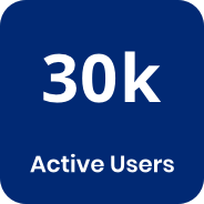
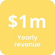
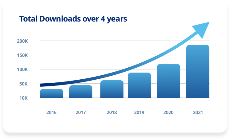
Growth Metrics


Download Now
Try the App on App Store & Play Store
The rebranding improved user retention and reduced acquisition costs by a good margin and helped us listen to the immense user feedback that our support team was monitoring 24x7, representing as Neurocycle's online support.